How to analyze landing pages: the four signals beyond bounce rate
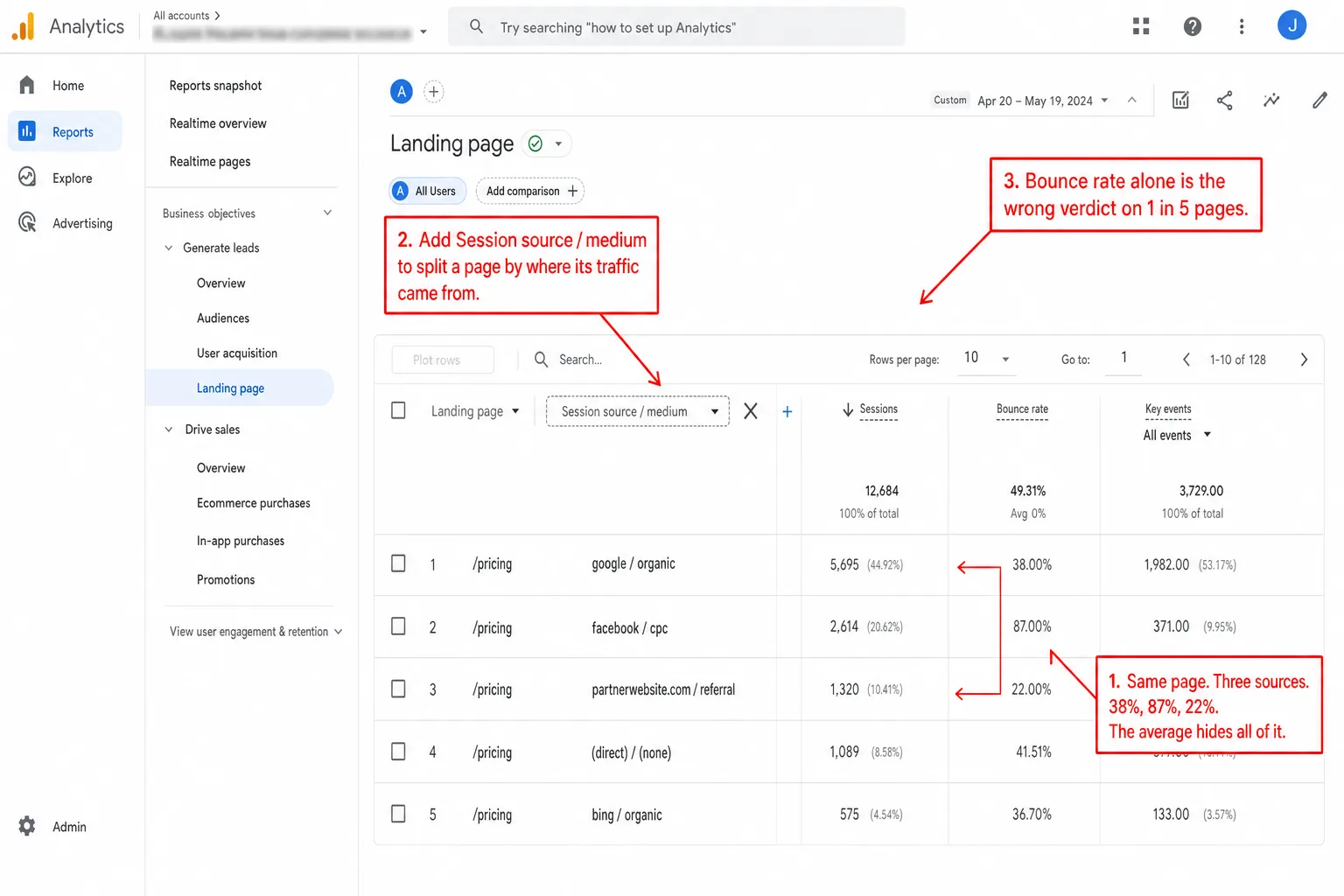
One in five "high-bounce" landing pages isn't broken. I pulled 1,007 landing pages across the sites we measure over the last 90 days, and 20.2% of the pages with bounce rate above 70% had engagement scores above 50. That means one page in five got flagged unfairly. These were visitors who scrolled deep and stayed for a real amount of time, on pages the bounce rate called failures.
The bounce rate said one thing. The behavior said another.
On the average landing page, most visitors never click through to a second page. That has been true for as long as landing pages have existed. So when your report opens with bounce rate as the headline metric, it's telling you what is normal, not what is working.
This article is the four signals to read instead, in order. The framework works in any analytics tool, GA4 included, once you know which sub-reports to chain together.
- Across 1,007 landing pages on the sites we measure in the last 90 days, 20.2% of pages with bounce rate above 70% had engagement scores above 50. One in five 'bad' landing pages had visitors who actually scrolled and stayed.
- 21.5% of landing pages had bounce rate and engagement score in opposing quadrants. Bounce rate alone was directionally wrong on roughly 1 in 5 pages we tracked.
- The four signals that actually evaluate a landing page: engagement score (scroll + duration combined), goal conversion rate, source × landing-page cross-filter, and entry-source share. Bounce rate is at best a fifth signal, not the first.
- GA4 already moved away from bounce rate in its default UI. Its replacement, engagement rate, is binary (engaged = 10+ seconds OR 1+ conversion OR 2+ pageviews). It's better than bounce rate, but it still collapses a multi-dimensional question into a single percentage.
- On most landing pages, single-pageview visits are the norm, not the failure case. Industry data and our own data both confirm this. A landing-page report that leads with bounce rate is telling you what is normal, not what is working.
Why bounce rate misleads on landing pages specifically
A landing page is a page where visitors arrive cold. They clicked an ad, a search result, a social share, a newsletter link. They didn't navigate from elsewhere on your site. The job of the page is to deliver one piece of value (a definition, a comparison, a price, a download, a signup) and then either send the visitor toward a goal or let them leave satisfied.
Bounce rate counts single-pageview sessions as a percentage of total sessions. That's all it counts. It doesn't care how long the visitor stayed. It doesn't care how far they scrolled. It doesn't care whether they clicked anything or hit a goal without ever leaving the page. A landing page is exactly the page where all of that matters. And bounce rate flattens it into one yes-or-no.
Here are four things that all show up as a "bounce" on a typical dashboard:
- The visitor read every word, scrolled to the bottom, copied a quote, took the next step off-site (called your sales team, opened your install command in a terminal, told their colleague).
- The visitor signed up, opted in, submitted a form, or triggered a goal event without leaving the page.
- The visitor arrived from a paid social campaign, looked at the headline, decided this wasn't for them, and closed the tab inside two seconds.
- The visitor was a bot or a low-quality referral that should never have counted in the first place.
Bounce rate can't tell number 1 from number 3. The reader who stayed for four minutes and the reader who fled in two seconds look identical in the report. That's the whole problem.
The four signals to read first
So stop opening a landing-page report with bounce rate. Read these four signals instead, in this order. The first three tell you how visitors behaved once they were on the page. The fourth tells you whether the page got the right visitors in the first place.
Each signal gets its own section below. Then I show you how to read all four in under a minute. Then I tell you what bounce rate is still good for, because it isn't nothing.
Engagement score: what stays after a single pageview
The first signal is engagement score. The recipe is simple: you take average scroll depth, you combine it with average session duration, and you turn it into one percentage. The exact formula doesn't matter as long as it uses both. I built ours as (avg_scroll + min(100, avg_duration / 6)) / 2. A visitor who scrolls the whole page and stays ten minutes scores 100%. A visitor who scrolls nothing and leaves in zero seconds scores 0. In plain English: the score rewards reading, not clicking. Everyone else lands in between.
The whole point is that this number survives a single-pageview visit. A visitor who landed, scrolled to the bottom, read for four minutes, and left has high engagement. Bounce rate calls them a bounce. Engagement score doesn't.
Here's what a landing-page report looks like when engagement sits right next to visitors, as a peer column, instead of buried below the fold:
The second row, /blog/server-side-tracking, is highlighted because that's the row I am about to click. Click it and every other panel on the dashboard updates to show only sessions where that page was the landing page. But the engagement column already told me something before I clicked. At 76%, this is a page where visitors stayed long enough to be worth a look. In practice, that row has earned my click.
The /integrations/wordpress row, sitting at 23% engagement, is a different story. Meaning: something on that page loses people. Maybe the page ranks for a query that doesn't match the content. Maybe the page is broken below the fold. I don't know yet. But the engagement number tells me where to spend my time before I go digging.
Most analytics tools built in the last five years compute some version of this score. GA4 has its own, called engagement rate, and I cover it later. The math differs from tool to tool. The principle doesn't. Do not judge a session by what happened at one page boundary. Judge it by what the visitor did on the page they landed on.
Goal conversion rate per landing page
The second signal is the page's conversion rate against its actual job. Every landing page has a job. A pricing page wants you to start a trial. A blog post wants you to read the next post, sign up for the newsletter, or share the link. A product page wants the contact form. A landing page with no goal defined is a page you aren't measuring. You are just watching it.
If your page sends visitors to a booking service or marketplace, measure the next step when checkout happens elsewhere. A booking-link goal can show progress before the external service confirms the outcome.
Measure each page against the goal that page is responsible for, not against your site-wide funnel. A blog post that turns 3% of its visitors into newsletter signups is doing its job well. Hold that same post against your trial-signup goal and it probably converts under 0.2%, because someone who just signed up for a newsletter isn't ready to start a trial yet. In other words: measure the page against its own job. Both numbers are true. Only one of them means anything for that page.
Put goal conversion right next to engagement and visitors, and the report starts to read like plain English:
- High visitors + high engagement + high goal conversion: the page is doing its job, send more traffic.
- High visitors + high engagement + low goal conversion: visitors are engaged but the offer is wrong. Test the CTA, the placement, the offer itself. Our examples show how to test the CTA without tracking people across sessions.
- High visitors + low engagement + low goal conversion: page is broken. Diagnose with scroll depth and exit triggers.
- Low visitors + high engagement + high goal conversion: the page works. Get it more traffic.
Most lightweight "Top Pages" reports don't show the goal column by default. You have to set up goals first, then add conversion rate as a peer column on the pages report. In Clickport the goal column shows up on its own once you configure a goal for the site, and it filters per page. In GA4 it hides under the "Key events" column on the landing-page report, and you add it by hand in the customization panel.
Get visitors, engagement, and goal conversion onto one row and you can read a landing page in about two seconds.
The source × landing page cross-filter
The third signal is the most useful move in all of landing-page analysis: cross-filter by source.
A landing page doesn't have one bounce rate. It doesn't have one engagement score or one conversion rate either. It has one number per traffic source. Take a 65% bounce rate. That single figure can be a 90% bounce from one Facebook campaign averaged against a 30% bounce from organic search. In other words: two completely different stories, mashed into one number. The campaign is bringing the wrong people. The organic traffic is fine. The 65% tells you neither.
To pull them apart in any modern analytics tool, you click the landing-page row, then you click the top source for that page, and you watch every other panel narrow to just that source-and-page pair. Then you click a different source for the same page. Now you put the two sets of numbers side by side.
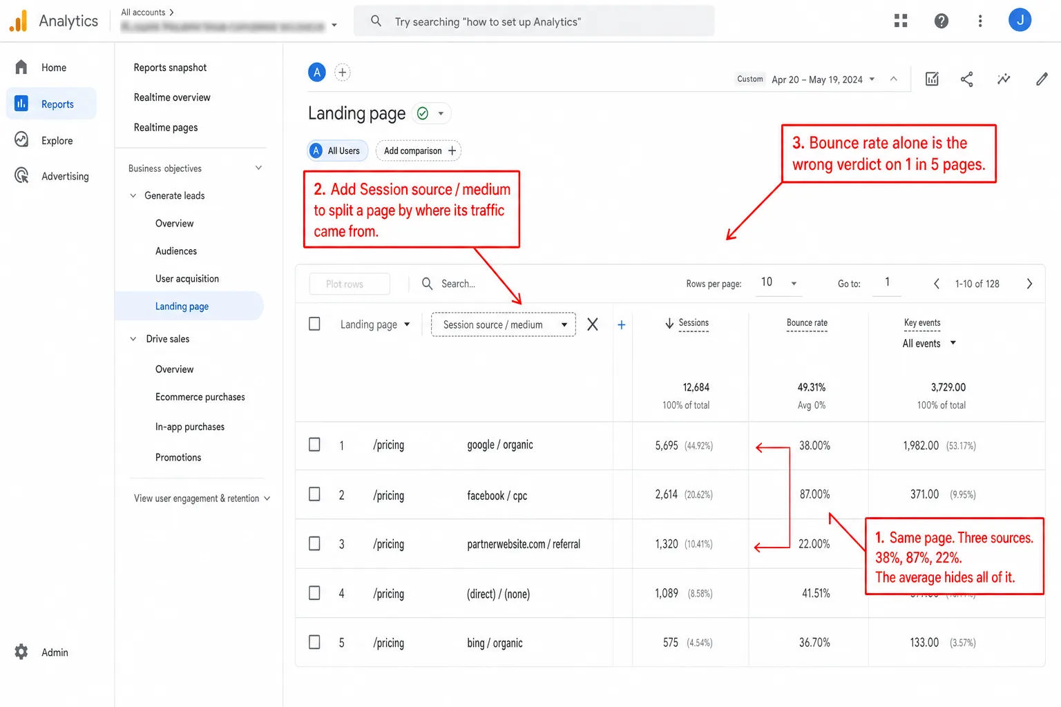
The same /pricing page on the same site can show:
- Organic Google: 38% bounce, 81% engagement, 5.2% conversion. The page is doing its job for search traffic.
- Paid Facebook campaign A: 87% bounce, 28% engagement, 0.4% conversion. The campaign is wrong about who should land here.
- Referral from a partner blog: 22% bounce, 92% engagement, 12% conversion. The traffic is pre-qualified and ready.
None of this shows up in an aggregate report. Put another way: the aggregate row would give you a 51% bounce rate and a shrug. One number, three completely different real situations underneath it. The cross-filter is what drags them into the light.
In GA4 this is the "secondary dimension" feature on the Landing Page report. Add "Session source / medium" as a secondary dimension and the same page splits into one row per source.
Here's the move I take from this. Stop optimizing the page. Start optimizing the traffic mix. A page that does great on organic and badly on paid social doesn't have a page problem. It has a paid-social targeting problem.
Entry-source share: is the page doing acquisition work?
The fourth signal flips the cross-filter around. For a given landing page, what share of its traffic comes from each source? Some pages are built to catch cold traffic: a paid-ad landing page, an organic-search piece. Others are built for people already on your site: a settings page, an account page, a deep documentation node. When a page that was never meant for cold traffic starts catching it, the report should tap you on the shoulder.
Entry-source share splits a page's visitors by where they came from. A blog post that pulls 70% of its visitors from Google organic and 20% from your newsletter is acting as an acquisition channel. A pricing page that pulls 80% from internal navigation is a conversion-funnel page, not an acquisition page. In practice, you optimize those two pages in completely different ways.
A page with a healthy spread of sources is doing real work. A page leaning on one dominant source is one of two things. Either it's narrowly successful, an SEO win on a single keyword. Or it's narrowly fragile, and the day that one campaign or one referral dries up, the page goes dark.
So here's how I run it for each top landing page. You look at the entry-source share. Then you jump to signal three, cross-filter by the biggest source, and you check whether that source sends engaged visitors or junk. Then you do it again for the next biggest source.
Across Clickport sites: how often does bounce rate disagree with engagement?
This is the number the whole article hangs on. I ran a query across all the sites we measure for the last 90 days, grouped by landing page, and dropped every page into one of four quadrants by its bounce rate and its engagement score. To keep noise out, a page needed at least 30 sessions to count. The test site was left out.
Two numbers fall out of this grid.
Of the 84 landing pages with bounce rate above 70%, 17 (20.2%) had engagement scores above 50. In plain English: one in five "high-bounce" pages were pages where visitors scrolled and stayed. If you trusted bounce rate as your headline, you'd have written off all 84 as broken. One in five of those calls would've been wrong.
Across all 1,007 landing pages, 216 (21.5%) had bounce rate and engagement score in opposing quadrants. That means every page where the two metrics handed you different verdicts, added up. So on roughly one page in five, whether you led with bounce rate or led with engagement would flip your conclusion.
The data doesn't say bounce rate is useless. It says bounce rate is the wrong thing to look at first. Put it next to engagement and goal conversion and it sharpens the picture. Read it on its own and it lies to you about one page in five.
I'll be straight with you about two things in this analysis.
First, Clickport's own bounce-rate calculation already folds in engagement signals. It doesn't flag a visitor as a bounce if they scrolled deep or fired an engagement event. So our high-bounce-high-engagement quadrant is smaller than it would be in a tool that uses the strict single-pageview definition. Run the same query in GA4, or in any tool using the classic definition, and the disagreement rate climbs, not drops. Our 20.2% is the cautious read. Meaning: the real gap is bigger.
Second, the 50% engagement threshold is a judgment call. Move it to 40% or 60% and the quadrant lines move with it. The shape of the story holds either way, but the exact number shifts. That's why the full method is written out right here. Run it on your own data, with whatever thresholds make sense for your site, and check me.
How to read a landing page in 60 seconds
If Google traffic has fallen, start with a business impact check. Compare the affected entry pages with defined outcomes before deciding which page needs work.
Put the four signals on one screen and reading a landing page gets fast. Here's the routine I run on my own dashboard:
- Open the Pages panel. Switch to the Entry Pages tab. Sort by visitors descending. Skim the top 10 rows.
- Find a page with high visitors and a flagged engagement score (red or amber if your tool color-codes the column). Click it. Every other panel filters to that page.
- Check the Sources panel. Which channel is sending the most visitors to this page? Click that source. The dashboard is now filtered by page-and-source.
- Read the four numbers in the KPI bar. Visitors, engagement, conversion rate, and (if relevant) average duration. These four together tell you whether this page from this source is doing its job.
- Clear the source filter and click the next biggest source for the same page. Compare the four numbers. If they're wildly different, you've got a traffic-mix problem, not a page problem.
That whole loop is four clicks. Once it's muscle memory, the slow part is reading the data, not collecting it. And the slow part is where the value lives.
For a high-engagement page the routine is identical, but the question turns around. It stops being "what is broken here?" and becomes "where do I find more traffic like this?". The Sources panel stops being a list of suspects and becomes a list of channels worth feeding.
Before a sale period, run this routine on the pages your campaigns will send people to. The Black Friday analytics checklist adds the other checks to finish in October.
What a high bounce rate actually means (and when to ignore it)
After all that, bounce rate is still useful. It's just not the first thing you should look at. So here's what a high bounce rate, above 70%, really tells you, page type by page type:
- On a paid-ad landing page: probably a targeting problem if engagement is also low. Probably a wrong-offer problem if engagement is high. Almost never a page problem in isolation.
- On a blog post or content page: usually fine. Content visitors read the thing and leave. Industry benchmarks put landing pages at 60-90% bounce as the normal baseline. Which means a 75% bounce combined with high engagement is the success case.
- On a docs page: almost always fine. People came for one specific answer. They got it. They left.
- On a pricing page: this one matters. If engagement is also low, the page isn't selling. If engagement is high but conversion is low, the offer or CTA is off.
- On a contact page: depends on whether form submissions are happening. In practice, a 90% bounce with a 30% form submission rate is a contact page doing its job perfectly.
- On a Single-Page Application (SPA) view: the bounce-rate definition breaks. Configure your analytics to fire on view changes (
pushState/replaceState), not on traditional page loads. A misconfigured SPA can show 95% bounce rates that have nothing to do with engagement.
Here's the one thing to hold onto. Bounce rate is a session-structure metric. It tells you whether a visitor made one request or many requests. It doesn't tell you whether the visit worked. And on any page where one request is the normal, expected pattern, that makes bounce rate close to useless by definition.
What about GA4's landing page report?
GA4 already walked away from bounce rate as the headline metric. The default landing-page report shows engagement rate instead, which is just the inverse of bounce rate. Engagement rate is the share of sessions that were "engaged", and GA4 calls a session engaged if it lasted at least 10 seconds, OR fired at least one conversion event, OR included at least two pageviews. In plain English: do anything at all and you count as engaged.
That's a real step up from classic bounce rate. It moves the bar from "did they request a second page" to "did they do anything on purpose". But it's still one binary signal squeezed into a single percentage. A session that lasted 11 seconds with zero scroll and a session that lasted 4 minutes with 90% scroll both count as "engaged". Which means the report can't tell those two visitors apart. You can.
The four-signal framework still works in GA4. You just have to build it by hand:
- Engagement score equivalent: GA4's "Average engagement time per session" gets you partway there. You add "Scroll" as a custom event via Enhanced Measurement to get the second component, then you create a custom calculated field or you read the two side by side.
- Goal conversion: the "Key events" column on the Landing page report. You make sure the key event is the page's actual job, not your site-wide signup event.
- Source × landing page: you add "Session source / medium" as a secondary dimension on the Landing page report. The report splits into one row per source per page.
- Entry-source share: the same trick, and you sort it differently.
One GA4 bug is worth knowing about while you're in there. When a visitor lands on a URL with query parameters and your data stream doesn't strip them, the report counts each parameter variant as its own separate page. So one page can show up as a dozen rows, each splitting the traffic. I covered this in detail in GA4 not showing data and (not set) in GA4. The fix is to configure your data stream to merge the variants, or to use a tool that merges them for you out of the box.
So GA4 has all four signals. You just have to go find them and bolt them together yourself.
Common questions
What are the metrics of a landing page?
The four signals from this article: engagement score (scroll plus duration), goal conversion rate, the source-and-page cross-filter, and entry-source share. Visitors and bounce rate ride along as supporting metrics. They help. But bounce rate on its own is never enough.
How can I track the performance of my landing page?
You open the page in your analytics tool. You check that it has at least one goal configured. You read the four signals in order. When one signal disagrees with another, say high engagement but low conversion, or low bounce but low engagement, that disagreement is your to-do item. The conflict is the insight.
Is a 70% bounce rate good?
It depends on the engagement score and the page type. A 70% bounce on a blog post with 80% engagement is a win. A 70% bounce on a paid-ad landing page with 25% engagement is a real problem. Same 70%, opposite verdicts. The number alone tells you nothing.
Is 40% bounce rate good?
On its own, 40% sits below the typical landing-page baseline of 60-90%, and a touch below the typical site-wide baseline of 50%. In plain English: it sounds great. But watch the trap. A 40% bounce paired with low engagement and zero conversions isn't a healthy page. It's a page people clicked through to get away from. A 40% bounce paired with high engagement and a 5% conversion rate is a page working exactly as designed. Same bounce rate, two different stories. Always read it in context.
How do I analyse a landing page in GA4?
You open the Landing page report under Reports, Engagement, Landing page. You add "Session source / medium" as a secondary dimension. You use "Key events" as your conversion column. You pull in "Average engagement time per session" for a rough engagement read. Then you sort by visitors and work down the list with the four signals from this article. It's more clicks than I'd like, but it gets you there.
Why is my bounce rate so high on some pages but not others?
Because bounce rate mostly tracks page type and visitor intent, not page quality. Documentation, contact pages, and single-purpose content pages run high bounce rates by design. People came for one thing, got it, and left. Multi-page funnels like signup, checkout, and product browsing run low bounce rates by design, because the whole point is to keep moving. Comparing bounce rates across those two groups is comparing apples to staplers.
Get the four signals on your own site
This framework was easy to write because it's what I built the dashboard to show by default. Engagement scores sit on every page row, every source, every country, every device. Goal conversion is a peer column, not a buried setting. Cross-filters chain in any direction you click. Entry-source share is one tap away.
If you want to read your own landing pages this way, start a free 30-day trial. The tracker is one script tag, and the dashboard is live a few minutes after you install it. Already on GA4 and not sure? I'd run both side by side for a week and read the same landing page in each. You learn something either way, whether you switch or not.
If you've got a landing-page question the framework above doesn't cover, hello@clickport.io reaches me directly.

Comments
Loading comments...
Leave a comment