Your First Dashboard
Once you've installed the tracker, data starts flowing in within seconds. Here's a quick tour of what you'll see.
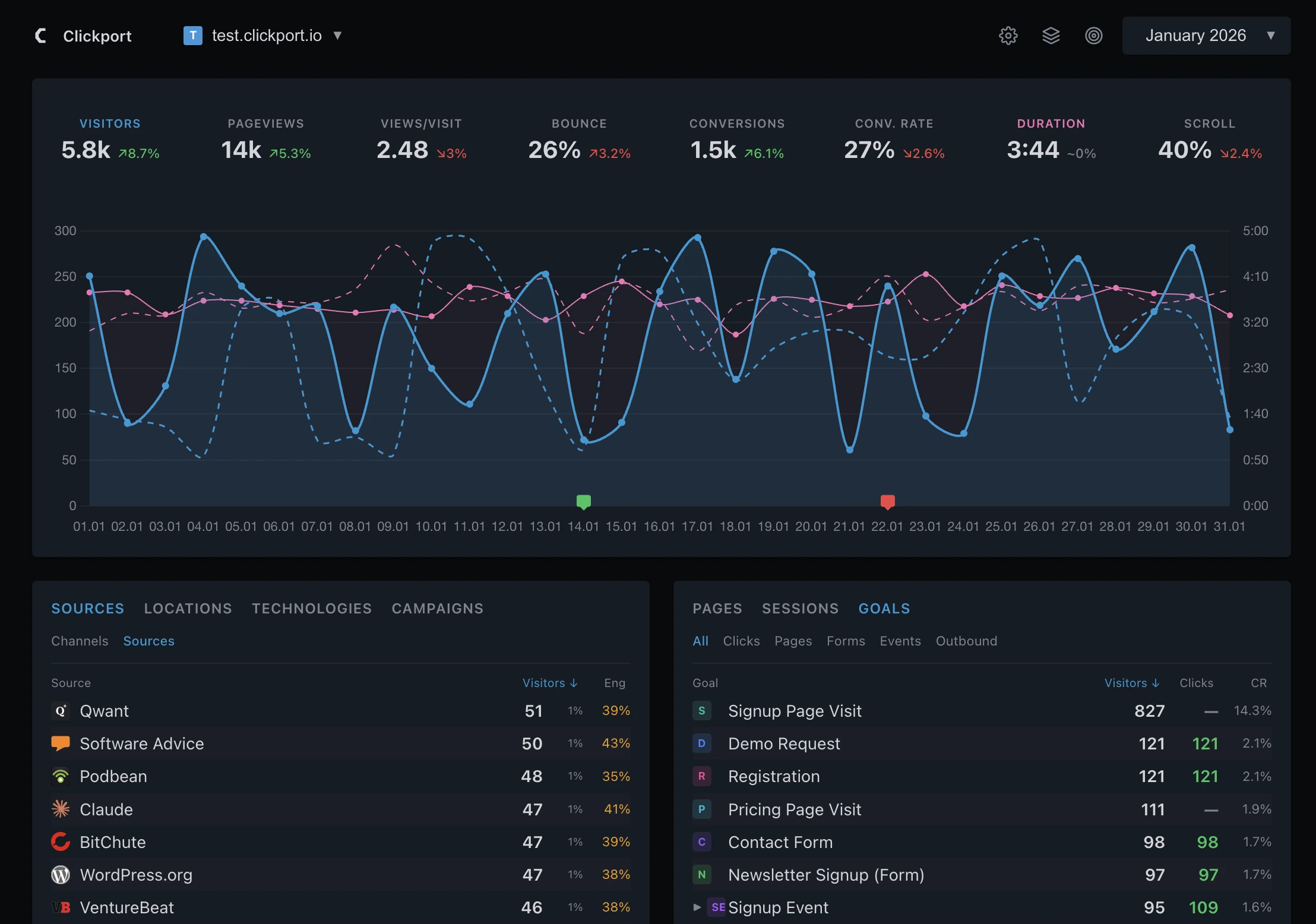
KPIs
The row of cards across the top shows your key metrics at a glance. Click any card to switch the chart below to that metric.
Each card shows the current value and a percentage change. Green means the metric improved, red means it declined. For bounce rate, a decline is actually good, so lower bounce shows green.
The default KPIs are Visitors, Pageviews, Views/Visit, Bounce, Duration, and Scroll. If you set up goals, two more appear: Conversions and Conv. Rate.
Chart
Below the KPIs, the chart visualizes the selected metric over time. Bucket size adapts to the range you pick: minute or hour for Today, Yesterday, and the rolling 24-hour window. Hour or day for the 7- and 14-day windows. Day or week for the 28-day window. Day, week, or month for All Time. A small pill on the selected row of the date picker lets you switch between the available bucket sizes. Hovering a data point shows a vertical guide line that snaps to the nearest bucket, with filled dots at every visible metric and a tooltip anchored at the top of the chart.
A dashed comparison line overlays a baseline so you can see the change at a glance. The comparison scope is yours to pick: Smart baseline (the default, a weekday-aware average of the last 4 matching periods), Previous period, or Year over year, with an optional Match day of week toggle. The exact comparison dates are shown so you always know what you are looking at.
Date ranges
The date picker in the top-right lets you switch between preset ranges or pick a custom window.
The default is Last 28 Days, a clean four-week window. When you pick Today or Yesterday, the chart switches to hour buckets so you can see the traffic pattern throughout the day. Use the Min pill on that row for minute-level detail. The interval pills (Min, H, D, W, M) are a subtle segmented control: the active interval shows as an accent-coloured letter on a faint segment, not a filled box. See Date Ranges for more.
Panels
Below the chart, two panel columns show where your traffic comes from and what visitors do on your site.
Traffic panels (left side)
- Sources: Switch between Channels (organic, social, referral) and individual source domains. Each row shows visitor count, percentage, and an engagement score.
- Locations: Map view, countries with flags, regions, and cities. Click a country to drill into its regions.
- Technologies: Devices, browsers, OS, and screen size categories.
- Campaigns: UTM-tagged traffic: mediums, sources, campaigns, content, and terms.
Content panels (right side)
- Pages: Your top pages by visitors, plus tabs for entry pages, exit pages, and 404 errors.
- Sessions: Individual visitor sessions with full event timelines. See exactly what each visitor did.
- Goals: Conversion tracking and outbound link clicks. See Goals for setup.
Cross-filtering
Click any row in a panel to filter the entire dashboard by that value. For example, clicking "Google" in Sources instantly filters all KPIs, the chart, and every other panel to show only Google traffic.
Active filters show in the filter panel. Click the X to remove a filter. You can stack multiple filters to narrow down exactly the segment you're interested in.
Realtime
The green dot in the top-left corner shows how many people are on your site right now.
Click it to open the Realtime view: a 30-minute live chart that refreshes every 30 seconds. You'll see a stream of individual sessions as they happen.
Settings
Click the gear icon in the top-right to open Settings. From here you can:
- Switch between light, dark, and system themes
- Exclude your own visits (see Exclude Your Visits)
- Configure goals and conversions
- Manage your sites and account
- View bot detection statistics
Next steps
Now that you know your way around, here are some things to try:
- Set up goals to track form submissions, button clicks, or specific page visits
- Track custom events with the JavaScript API
- Configure the tracker for advanced options like proxying or manual pageviews